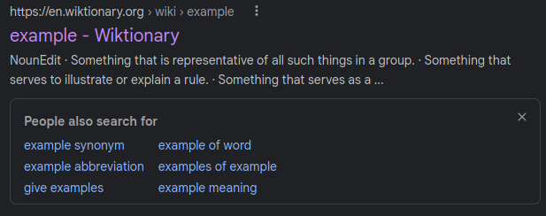
When using Google, I sometimes look at a result, then go back to the results page to check another result. When I go back, Google sometimes pops up a box with related searches around the result:

It only does this sometimes, it seems to only happen when I’m using a browser in the right half of an A/B test and when there are enough related search suggestions. But the UI for this is terrible. It doesn’t pop up right away, so it looks like you can move your mouse to the result below and click it, but then the related search box comes up right as I’m clicking on the result below, causing me to accidentally click on a related search. It’s a very annoying experience. It seems like the box is perfectly timed to come up at just the right time to get me to accidentally click it while trying to click on the result below.
I have literally never intentionally clicked on one of the related searches in that box: if I wanted related searches, I can always go to the bottom of the page for that. But I have accidentally clicked on that box so many times. It’s very infuriating.
The worst part of this is that someone at Google is probably looking at the results of their A/B test and thinking “Wow, this new feature is great. Look at how many people are using related searches when they can’t find what they’re looking for!” But most of those uses are just misclicks: it seems that they are optimizing for more searches (and thus more ad views) rather than actually looking at how features are used.